Typography - Task 3: Type Design & Communication
Typography - Task 3: Type Design & Communication
November 10,2023
13 November 2023 - (week9-week13)
Yang Jia Yi (0369288)
Typography/Bachelor of Design/(Honours) in Creative Media
Task 3: Type Design & Communication
Table of contents
1.Lectures
4.Feedback
1.Lectures
Week 7:Task 2 -Type Expression and Formatting -Exercise 1&2
-Task 1 Exercise 1&2
2 .Instructions
3.Work progress
Before I started, I searched the Internet.
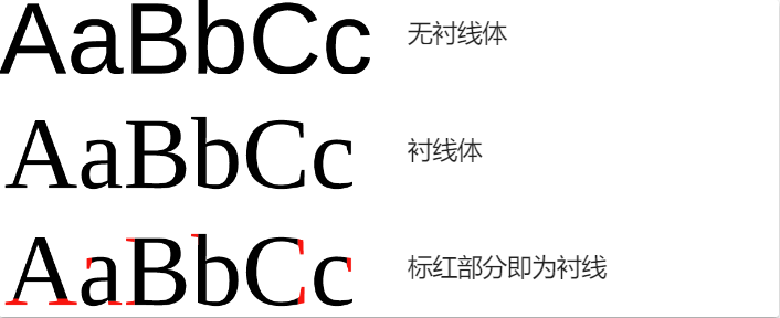
The letter strokes in some objects have decorative details that become
serifs. Fonts with serifs are called serifs, and fonts without serifs are
called sans-serifs.
|
| Fif1.1 serifs and sans-serifs. |

|
| Fif1.2 basic knowledge |

|
| Fif1.3 basic knowledge |

|
| Fif1.4 basic knowledge |
serifs
1. Bodoni is a famous serif font that came after Didot. The two
fonts are often compared side by side. Bodoni's strokes are bolder while
retaining the elegant glyphs. The ease of use is much higher than
Didot.

|
| Fif1.5 serifs of Bodoni |
|
| Fif1.6 serifs of Trajan |
3.Helvetica is a sans-serif typeface widely used in the Latin alphabet, designed by Swiss designers Max Miedinger and Eduard Hoffmann in 1957. Made for typesetting.

|
| Fif1.7 serifs of Helvetica |
Univers is a Western sans-serif font. In graphic design circles, it is
known as Swiss-style typeface along with Helvetica, and was originally
published as a phototypesetting type by the French Deberny,Peignot type
foundry. Univers was designed by typeface designer Adrian Frutiger.
Another famous font, Frutiger, is also his work. The Univers font is
precise and evenly drawn, and has a more rational outline than
Helvetica. Both large and small characters have better formatting

|
| Fif1.8 sana-serifs of Univers |
This is also the font I design most often.
Task instruction
material: Graph paper + 3 marker pens (your choice but must be 3.0
above)
Task 3:
- Select a preferred font from the 10 fonts provided. Using the following
letters H,o,g,b,
do a detail dissection of the letters (write observations in eportfolio)
- Sketch the following letters ODHNG /
odhng using the 3 pens.
Explore 3 different writing styles for each of the 3 pens.
Sketches

|
| sketches1.1 |

|
| sketches1.2 |

|
|
sketches1.3 |

|
| sketches1.4 |

|
| sketches1.5 |
In the new edition, I did not redesign the more decorative fonts.However, I also realized that my font was not in a straight line.


|
| finnal sketches |
Select a preferred font from the 10 fonts provided. Using the
following letters H,o,g,b,
do a detail dissection of the letters (write observations in
eportfolio),In comparison, my design is the most similar to
baskervile font.


|
Baskerville's typeface design is one of his most important
legacies.
He worked to improve the typeface design of the time, especially in
terms of stroke fineness, letter spacing, and overall proportion.
His typeface design features include smooth curves of strokes, clear
shapes, and uniform thickness variations, making letters more
legible when printed.
My analysis


The left and right lines are not the same, they are not
symmetrical, the right lines are a little more spaced than the
left, the upper and lower lines are the same, and the inner
circle is different

The lines here will
almost have a slight gap, the inside of the circle is not
the same, the upper and lower lines are not uniform

The lines here are not uniform, there will be differences, the bottom four circles are the same, the end of the h is the same arc
I started designing digitally

|
| Digitalization1.1 |

|
| Digitalization1.2 |
When I began to analyze my own font, I found that some of my strokes were not uniform, and the vertical strokes were not exactly the same, so I made new changes.
After reading my work, the teacher pointed out the problem, the
most important is that there is no unity, it does not seem to be a
whole,I made the next change.
Fontlab

|
| Final Digitalized oledsnchtig,.!# |
At the end of the digitization, I started to learn about
fontlab.

|
| Fontlab of side bearing |
 |
| FontLab Screengrab |
Finnal work
Download Fonts Here:

|
| process of poster1.1 |

|
| Type Design and Communication,jpg |
Type Design and Communication,pdf

|
| Black poster,jpg |
Black poster,pdf
4.Feedback
Week 8 -specific feedback
The teacher looked at my draft and pointed out a big problem. My
fonts were not being designed, they were being drawn, so I
reworked them.
Week 9 -general feedback Start
searching the Internet for typographic anatomy.
-specific feedback The letters should be in a
horizontal line, and when writing the font, it should be
designed at the same Angle, and the Angle should not be
changed.
Week 10
-general feedback keep letters uniform.
-specific feedback The letter d should be full
and the other letters should be on a horizontal line. The
teacher pointed out that my draft was not on a horizontal
line, and I revised it.
Week 11 -general feedback The words have to be
consistent. They have to look consistent.
-specific feedback After reading my works, the teacher said that my careless size is
not the same, some letters are too thick, some letters are too thin,
I modified.We began to approach fontlab for further refinement.
Week 12 -general feedback Start learning fontlab and start making posters.
-specific feedback We started to learn fontlab. I started to set the font according to
the teacher's video, I installed the software on the official
website, and then we completed the final font setting in
fontlab.After finishing the font in fontlab, I completed the poster
in ai, signed my name, and paid attention to the requirements given
by the teacher. The specific feedback will wait for the next class.
5.Reflection
Experiences: I searched the Internet for some theoretical knowledge and
basic knowledge about typeface. I also searched how other
designers designed and conceived, and made reference to the
creation of designers. However, my ability was limited, and
the draft I designed was rejected by the teacher.
Observations:In the design process, the most important thing is to
maintain consistency, the Angle can not be changed, like some
smooth letters, we have to think about how to make it look
smooth and flowing, not blunt.
Finding:The font is not a casual design, it pays attention to
aesthetics, so that users can use it more enjoyable, a set of
fonts is not easy to come out, consider a lot of problems, word
spacing including details are very important.
6.Further reading

It is often useful to think of your text area
divided into columns - consistent horizontal intervals that
allow for more than one fieid of text per page. Working with
columnar layouts heips you maintain a manageable line length
and allows white space onto the page in piaces other than the
margins. Keep in mind the dynamic relationship between type
size, leading, and line length.
Horizontal layouts allow for wider fields of text, which tend
to support sustained reading more comfortably than narrower
fields.Columnar layouts are effective for many different formats.
Above, a three-column layout is applied to each of the three
panels on an 8.5 x 11 in (216 x 279 mm) sheet.
Cross-aligning headlines and captions with text type
reinforces the architectural sense of the page-the structure
-while articulating the complementary vertical rhythms. In
this example, four lines of caption type (leaded to 9 pts.)
cross-align with three lines of text type (leaded to 13.5
pts.).


评论
发表评论